


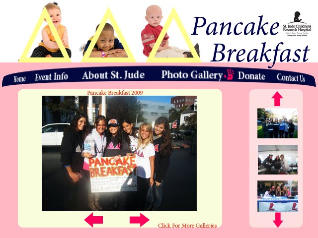


Event Choice:
I decided to use the same event for my website as I had already done for my poster. I really liked working with this event and I felt like I would be able to provide a lot more information about it than I was able to do on the poster project. I had a lot of corresponding pictures to go along with it and it is an event that I am personally involved in so it makes it that much more relevant.
Design Strategy:
I didn’t want my design to be too complex but I also didn’t want to be too simple. There was a lot that I incorporated into it including the cause that the non-profit event is benefiting and the actual event itself. I knew that I wanted to use a lot of pictures because images give the viewer a feel for what the event is actually like. My navigation bar actually took the most time because figuring out how to put the children in the “deltas” was really difficult. I had a handprint represent which page you are on because one thing that the St. Jude children do is finger-paints. In addition I wanted to add a lot of color to my project to make it more visually appealing and attractive because this is supposed to be a fun event. In addition It is a little bit childish in its portrayal because it is for a children’s hospital.
Color/Typeface Choice
Like I said before I used a wide variety of different colors for my website. Some of the more prominent colors would be those in the Nav bar, which are Navy (R:0 G:2 B:76) and yellow (R:255 G:255 B:0). I chose the typeface Minion Pro Italic because it really resembled the font the St. Jude Hospital uses. For the actual body text in the website I also used Minion Pro but I regular as opposed to italic.
No comments:
Post a Comment