
When it comes to type, companies use different wordmarks to help convey a message of who they're trying to target. However, from time to time, it can have some mixed results.
A good example of a wordmark that works is Microsoft's. The first thing that jumps out is that it uses a sans serif font. One can see that Microsoft is a leading innovator of technology by showing it's applying new ideas through this, as it breaks away from a traditional serif mark, which usually is used to show how a company has had a prestigious history and that they've been well established. Microsoft, by using a sans serif, shows it's not about the past, but rather the future. Likewise, notice that the font is italicized. The fact that it leans forward can also show how the company is looking towards the future and driving innovation forward. The cut off at the "o" also paints an image of the "s" cutting into it and helps make a unique touch for the logo that helps it become easily recognizable worldwide.
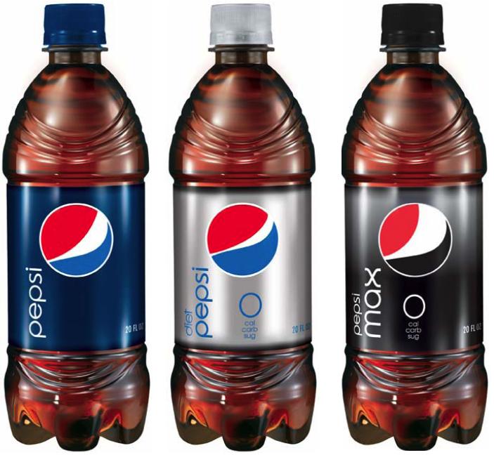
A wordmark that sends mixed messages and isn't as effective is Pepsi's recent redesign. The lower cased font cheapens the look of the design and makes it feel like an inferior cola, especially when taking into account the classic script wordmark of rival Coca-Cola. It also goes against Pepsi's branding of yesteryear considering that "Pepsi" was spelt out in all-caps for quite a few decades. However, what makes it more bland is the fact that the wordmark is a slightly modified version of the wordmark used for Diet Pepsi well back in the 1970s. By going with a retro, and very much so dated, look with their font, which is sans serif and is characterized with very rounded edges, one would think that Pepsi is aiming for the generation that grew up in the 1970s. The problem is, however, that Pepsi has always marketed itself as the "young, hip" cola going up against the "old and tired" Coca-Cola brand. By using a 1970's font for its wordmark, yet being a cola that's aimed for the younger generation, Pepsi misses the mark of who the target is for their product in their mark. It also doesn't help that they switched from a very recognizable wordmark to a fairly new one in such a short amount of time.
Ryan,
ReplyDeleteGood calls on your observations. There are a lot of people who are unhappy with the Pepsi rebrand. There are some hilarious renderings of what exactly the graphical element is ranging from a beer gut emerging from a guy with red shirt and blue pants to many other parodies. Remind me, and I'll try to find/send links to you.
Microsoft is interesting - it's bold, slightly altered in parts. To me it says "we mean business." There's also contrast between the word soft and the thick weight of the bold letters. Another fun company to check out: Apple. You should see the first logo they used before they became the monster they are today. It was a graphic illustration of Isaac Newtown with a custom scripty font for the company name.
Keep up the good work!
paul