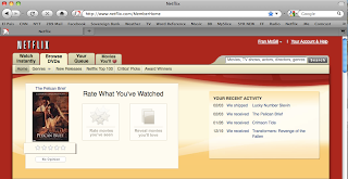
 Netflix.com is a terrific website and has a very user-friendly interface. Customers use the website to select which movies they want to rent. My favorite part of the website is that in addition to allowing you to browse Netflix's library of movies, it also offers suggestions based on the movies you have viewed in the past. The design of the website is simple and effective. The website has several different sections on its home page which correspond to specific generes offered by Netflix. The most important information for the user is at the top of the screen. It lets the user navigate through the site. Additionally it also shows the user what movie(s) are currently in the mail and when they should be arriving.
 Overall I think Netflix's website suits the needs of its customers well without trying to be too fancy in its presentation.

Good site choice and points. I've never used Netflix, but I would have liked to see more explanation of how the site's design makes it easy to use/how it functions. Also, what might this say about our media culture at the moment with so many people using the service.
ReplyDeleteKeep up the good work.
Cheers,
paul