
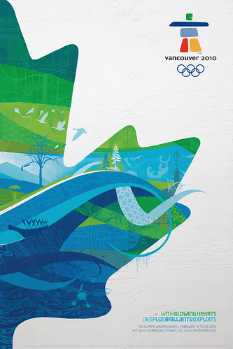
 With the Olympics going on right now I decided to analyze a poster for the 2010 Vancouver Olympic games. All in all I have to say that this poster does a very nice job of conveying it's message. You can tell it's for the Olympics with the use of the Vancouver 2010 games logo in the upper right hand corner. However, the most visually striking part of the poster has to be the maple leaf. The silhouette of a maple leaf, which is Canada's most recognizable symbol, is seen in the poster. The effect of having it split in half allows the poster to not be cluttered and have a nice artistic value to it. The use of the color is important too, as green and blue, the official colors of the games, are dominantly placed inside the leaf. These colors are symbolically important too, as the blue represents the sea and the green the land, as Vancouver has been known as a city where its port is key in trading and its dramatic landscapes have been awe-inspiring. There's many different designs going on inside the leaf, as well, with a variety of patterns being used. The most effective I believe are the blue waves that bleed off the leaf and provide a nice flow. Lastly, the poster makes good use of having the slogan and information on the bottom right hand corner. It's also worth noting that there's a second poster with the left half of the leaf, so having both posters leads to a cool effect with a full maple leaf. With the Olympics being such a world-renowned event, it's nice to see that the organizers put much thought into the design of their poster, which all in all effectively conveys its message.
14 hours ago
Great job, Ryan! Would have liked you to use more gestalt vocab to describe the design - like closure on the leaf - you don't see all of it, but you know what it is and it's there, and continuation - how the wave of blue points the eye subtly towards the bottom of the page.
ReplyDelete