Design:
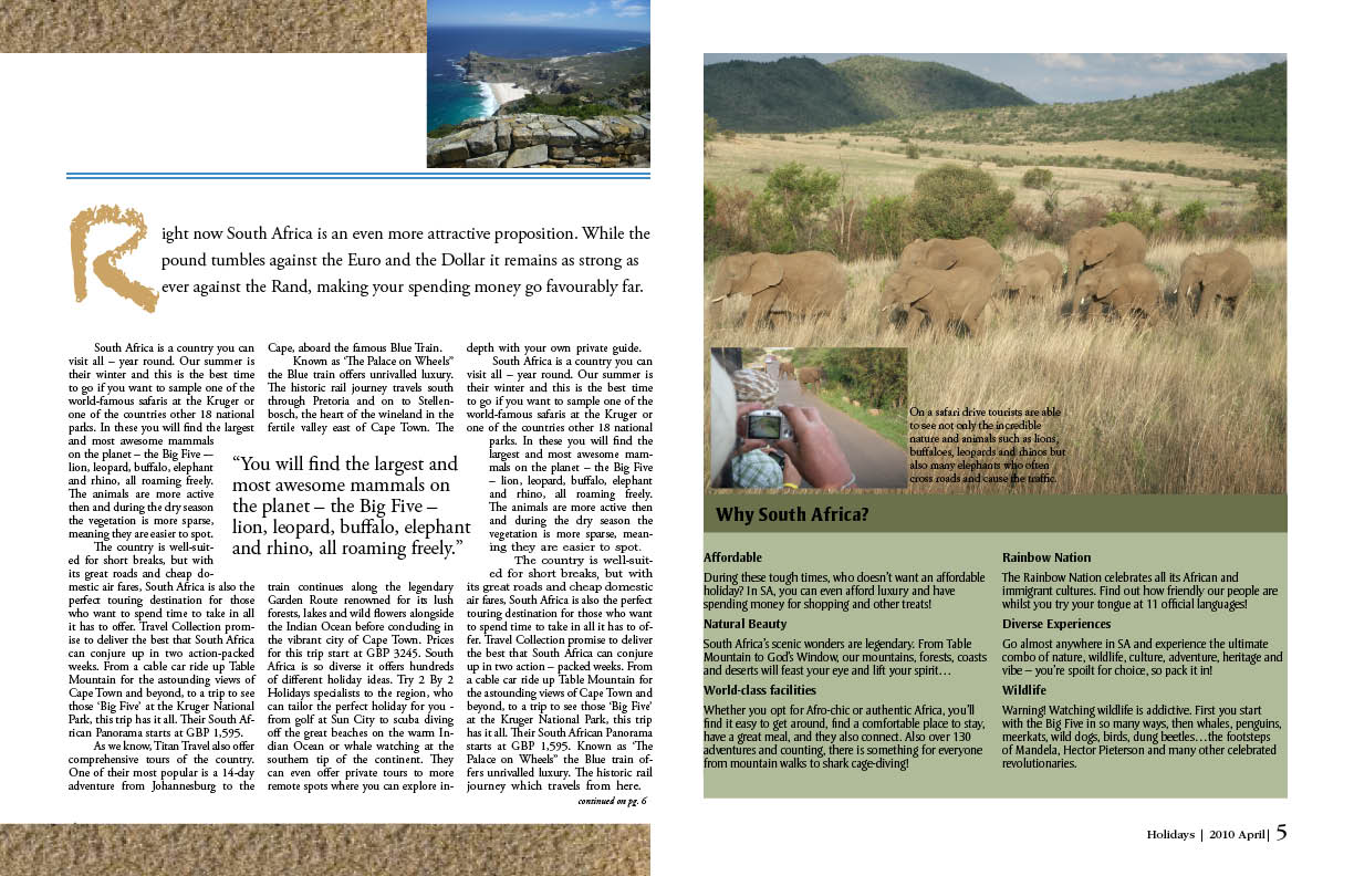
I decided to make a travel magazine on South Africa because I had opportunity to travel there and take a lot of pictures. Since I had to apply images to the text, I was missing couple & had to look for them in google images. I had also found a text in LexisNexis but it didn’t have the author (it had only the name of the newspaper & the date published) so I made up one. For the first spread I found an image of the sand and made it my background in which I put my pictures which explained the text under the headline. Sand represents awesome beaches South Africa has. I used three rows and columns to distribute pictures and text appropriately. For the second spread, I used some elements of the sand to bring the gestalt in there and putt he first letter of the text in the same headline’s font. I used three grid style in the first and four grid in the second page. My folios were not visible throughout the magazine because of the bleeding and background; however, at least I was able to have it on the fifth page.
Typography:
For a magazine name I chose a classy Stempel Garamond LT Std type. I thought of this magazine be oriented more to rich European travelers, so I wanted to look it formal. For the headline of the jump spread I chose Chaldusker because I thought it represented African spirit very well - some wildness of the nature. For some extra text, I chose Garamond 3 LT Std type, which was easy to read. For captions I also used a type from Garamanod family - Simoncini Garamond Std. I thought that varying types throughout the pages brought some vitality & freshness. My main body text is in Adobe Garamond Pro. I found this type easy to read & relevant in travel magazines. For the sidebar I used Strayhorn type since I wanted to use some sans serif typography in the magazine. I haven’t used much of different colors since my pictures were very colorful. However, I used some tones of khaki for the sidebar. I also used a caramel color for the first letter of the second spread text.


No comments:
Post a Comment